TCGA学习笔记7-绘制热图

上面,我们根据差异表达提取出来的4913个基因在611个样品中的表达数据进行了主成份分析,根据主成份成分的结果,正常与肿瘤样本能很好地分成两类,这对样本的预测是很好的辅助。下面,我们将根据差异表达的结果来绘制热图,看能否找出预示肿瘤组织的标志分子。

1
2
3
4
5
6
7
8
9
10
11
12
13
14
15
16
17
18
19
20
21
22
23
24
25
26
27
28
29
30
31
32
33
34
35
36
37
38
39
40
41
42
43
44
45
46
47
48
49
50
51
52
53
54
55
56
57
58
59
60
61
62
63
64
65
66
67
68
69
70
71
72
73
74
75
76
77
78
79
> library(gplots) # 在R中,绘制热图的程序有很多,这里我们使用gplots::heatmap.2;
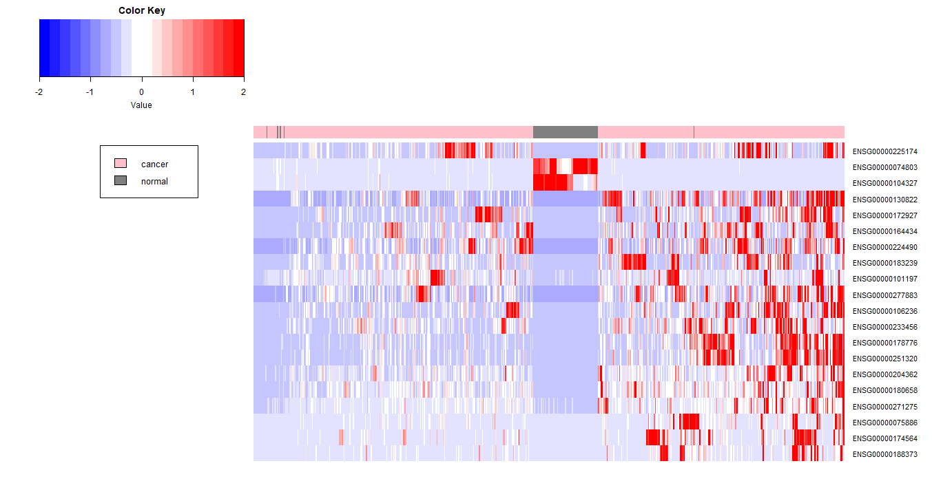
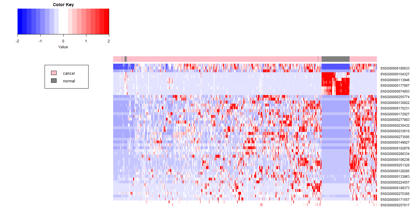
# 首先,我们使用TOP20 Genes来绘制热图
> result_select_FCOrder <- result_select[order(abs(result_select$log2FoldChange),decreasing=T),] # 差异表达基因,按FoldChange的绝对值从大到小排序
> result_select_top20 <- result_select_FCOrder[1:20,] # 选取表达差异最大的20个基因
> head(result_select_top20)[,1:3]
log2 fold change (MLE): group cancer vs normal

DataFrame with 6 rows and 3 columns
baseMean log2FoldChange lfcSE
<numeric> <numeric> <numeric>
ENSG00000224490 1714.56503681026 8.4424354795262 0.238664257501869
ENSG00000074803 22193.654237283 -8.27581699230162 0.332982800750979
ENSG00000178776 886.398761602384 7.70696160260639 0.326179843061095
ENSG00000204362 354.175131758015 7.57039832393765 0.294534084998158
ENSG00000104327 2844.95684727121 -7.52918926148832 0.286386451386388
ENSG00000164434 11701.5196273703 7.44063941927556 0.324756004054849
> result_select_top20$log2FoldChange # 看一下变化倍数,18个基因在cancer中高表达,2个基因在normal中高表达
[1] 8.442435 -8.275817 7.706962 7.570398 -7.529189 7.440639
[7] 7.330764 7.310661 7.228141 7.097977 7.050444 6.976768
[13] 6.922567 6.909435 6.888393 6.851913 6.846070 6.616500
[19] 6.581890 6.495955
> dataTop20 <- data[rownames(result_select_top20),] # 把reads数加进去
> dim(dataTop20) # 20行,611列
[1] 20 611
> head(dataTop20)[,1:3]
TCGA-CZ-5465-01A-01R-1503 TCGA-BP-4355-01A-01R-1289
ENSG00000224490 8222 864
ENSG00000074803 19360 100
ENSG00000178776 1165 97
ENSG00000204362 201 519
ENSG00000104327 24 35
ENSG00000164434 17120 6341
TCGA-CZ-5451-01A-01R-1503
ENSG00000224490 3772
ENSG00000074803 10
ENSG00000178776 423
ENSG00000204362 20
ENSG00000104327 6
ENSG00000164434 21755
> heat <- data.matrix(dataTop20) # heatmap.2需要使用矩阵做输入,因此先转化为矩阵
> dim(heat)
[1] 20 611
> heat_scaled_t <- scale(t(heat)) # 行列转置,并对每个基因的表达进行标准化
> heat_scaled <- t(heat_scaled_t) # 标准化后再行列转置回来
> head(heat_scaled)[,1:3]
TCGA-CZ-5465-01A-01R-1503 TCGA-BP-4355-01A-01R-1289
ENSG00000224490 2.62485660 -0.3517755
ENSG00000074803 -0.07491003 -0.2754319
ENSG00000178776 0.19061196 -0.4436383
ENSG00000204362 -0.17801482 0.2129373
ENSG00000104327 -0.25582838 -0.2548436
ENSG00000164434 0.21122299 -0.2379535
TCGA-CZ-5451-01A-01R-1503
ENSG00000224490 0.8246374
ENSG00000074803 -0.2763689
ENSG00000178776 -0.2500376
ENSG00000204362 -0.4005379
ENSG00000104327 -0.2574398
ENSG00000164434 0.4043701
> my_palette <- colorRampPalette(c("blue","white","red")) # 从低到高
> heat_scaled_limit2 <- ifelse(heat_scaled>2,2,heat_scaled) # 这里要做一个变换,即把标准化后大于2的值都等于2,是为了使图形色彩更加鲜明突出
> max(heat_scaled_limit2)
[1] 2
> colnames(heat_scaled_limit2) <- paste(group,1:length(group),sep="_") # 修改列名
> condition_colors <- unlist(lapply(colnames(heat_scaled_limit2),function(x){
+ if(grepl("cancer",x)) "#FFC0CB"
+ else if(grepl("normal",x)) "#808080"
+ })) # 定义分组颜色
> heatmap.2(heat_scaled_limit2,
+ trace="none",
+ density="none",
+ col=bluered(20),
+ cexRow = 1,
+ ColSideColors = condition_colors,
+ hclust=function(x) hclust(x,method="average"),
+ labCol = NA,
+ dendrogram = "none", # 去除dendrogram,但保留clustering
+ margins=c(2,10))
> legend(0,0.8,legend=c("cancer","normal"),fill=c("#FFC0CB","#808080"),cex=0.8)

下面,我们使用TOP50再来绘制热图

1
2
3
4
5
6
7
8
9
10
11
12
13
14
15
16
17
18
19
20
21
22
23
24
25
26
27
28
29
30
31
32
> result_select_top50 <- result_select_FCOrder[1:50,]
> result_select_top50$log2FoldChange
[1] 8.442435 -8.275817 7.706962 7.570398 -7.529189 7.440639
[7] 7.330764 7.310661 7.228141 7.097977 7.050444 6.976768
[13] 6.922567 6.909435 6.888393 6.851913 6.846070 6.616500
[19] 6.581890 6.495955 6.432374 6.425309 6.424296 6.394360
[25] 6.388963 6.377904 6.356020 -6.275527 6.256749 6.229892
[31] 6.196778 6.186268 -6.185622 -6.149709 6.116301 6.095080
[37] 6.042014 6.007039 -5.927111 -5.869138 5.853670 5.793502
[43] 5.756366 5.729011 5.714809 5.699259 5.695577 -5.694465
[49] 5.681664 5.677330
> dataTop50 <- data[rownames(result_select_top50),]
> heat <- data.matrix(dataTop50)
> heat_scaled_t <- scale(t(heat))
> heat_scaled <- t(heat_scaled_t)
> my_palette <- colorRampPalette(c("blue","white","red")) # from low to high
> heat_scaled_limit2 <- ifelse(heat_scaled>2,2,heat_scaled)
> condition_colors <- unlist(lapply(colnames(heat_scaled_limit2),function(x){
+ if(grepl("cancer",x)) "#FFC0CB"
+ else if(grepl("normal",x)) "#808080"
+ }))
> heatmap.2(heat_scaled_limit2,
+ trace="none",
+ density="none",
+ col=bluered(20),
+ cexRow = 1,
+ ColSideColors = condition_colors,
+ hclust=function(x) hclust(x,method="average"),
+ labCol = NA,
+ dendrogram = "none",
+ margins=c(2,10))
> legend(0,0.8,legend=c("cancer","normal"),fill=c("#FFC0CB","#808080"),cex=0.8)

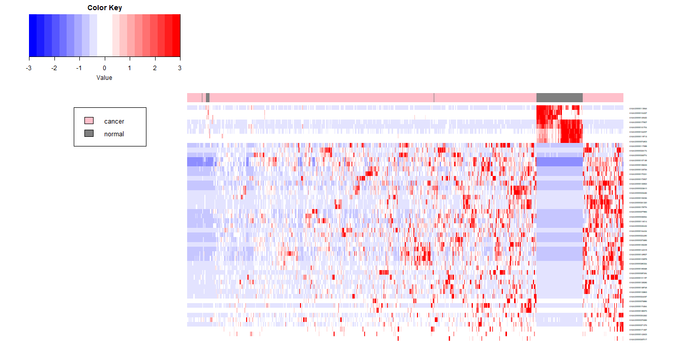
如果将标准化后的值限定在3以内,看一下图像的变化,颜色会变淡一些

1
2
3
4
5
6
7
8
9
10
11
12
13
14
15
16
17
heat_scaled_limit3 <- ifelse(heat_scaled>3,3,heat_scaled)
colnames(heat_scaled_limit3) <- paste(group,1:length(group),sep="_")
condition_colors <- unlist(lapply(colnames(heat_scaled_limit3),function(x){
if(grepl("cancer",x)) "#FFC0CB"
else if(grepl("normal",x)) "#808080"
}))
heatmap.2(heat_scaled_limit3,
trace="none",
density="none",
col=bluered(20),
cexRow = 0.4,
ColSideColors = condition_colors,
hclust=function(x) hclust(x,method="average"),
labCol = NA,
dendrogram = "none",
margins=c(2,10))
legend(0,0.8,legend=c("cancer","normal"),fill=c("#FFC0CB","#808080"),cex=0.8)

若限定在4以内,颜色进一步变淡

1
2
3
4
5
6
7
8
9
10
11
12
13
14
15
16
17
heat_scaled_limit4 <- ifelse(heat_scaled>4,4,heat_scaled)
colnames(heat_scaled_limit4) <- paste(group,1:length(group),sep="_")
condition_colors <- unlist(lapply(colnames(heat_scaled_limit4),function(x){
if(grepl("cancer",x)) "#FFC0CB"
else if(grepl("normal",x)) "#808080"
}))
heatmap.2(heat_scaled_limit4,
trace="none",
density="none",
col=bluered(20),
cexRow = 0.4,
ColSideColors = condition_colors,
hclust=function(x) hclust(x,method="average"),
labCol = NA,
dendrogram = "none",
margins=c(2,10))
legend(0,0.8,legend=c("cancer","normal"),fill=c("#FFC0CB","#808080"),cex=0.8)

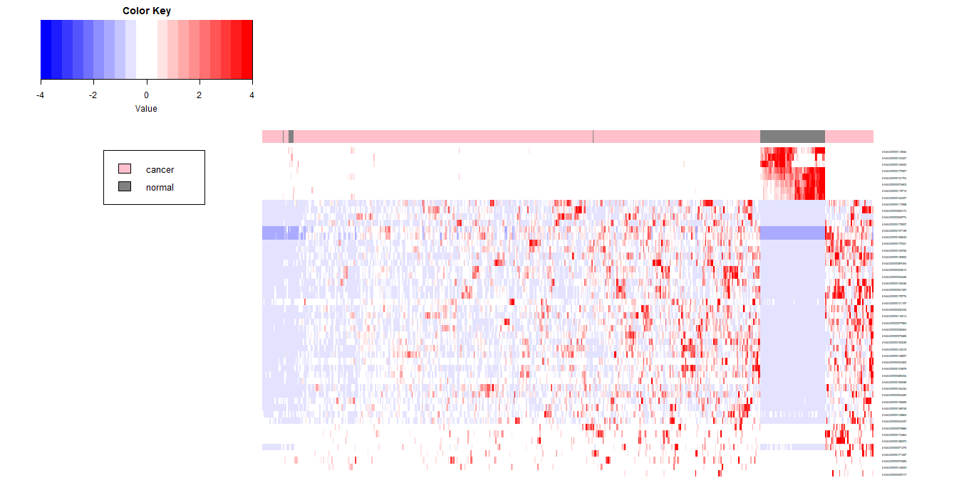
注意:对标准化后的值进行限定,基本不会对样本的聚类产生影响,但是会影响基因间的聚类,因此,产生的图像也会不同。

  • 本文作者:括囊无誉
  • 本文链接: TCGA/TCGA7Heatmap/
  • 版权声明: 本博客所有文章均为原创作品,转载请注明出处!
------ 本文结束 ------
坚持原创文章分享,您的支持将鼓励我继续创作!